Yankees leverage wins by throwing money at their players
Posted by mark in sports, Uncategorized on September 26, 2010
Today’s New York Times sports section provided this intriguing graphic on “putting a price tag on winning”. Their hometown Yankees stand out as the big spenders by far. It paid off in wins over the last decade – the period studied. However, if you cover up the point depicting the Yanks, the graph becomes far less compelling that salary buys wins – mainly due to counteractive results enjoyed by two low-payroll teams: The Minnesota Twins and the Oakland Athletics.
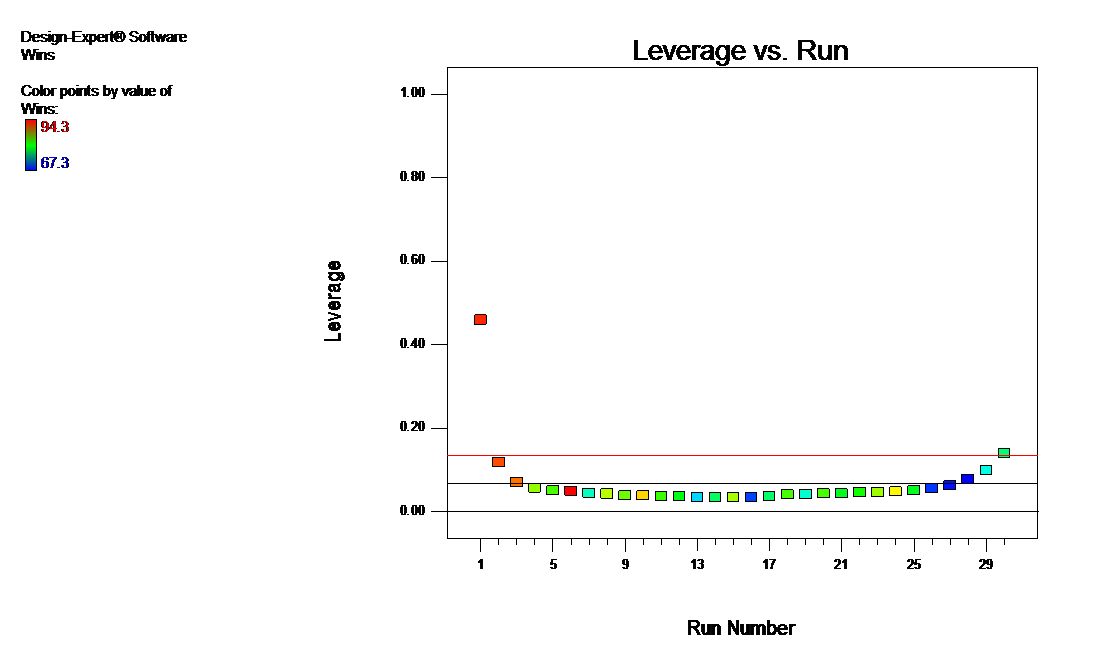
I found similar patterns and, more importantly, data to reproduce these, in this study of MLB Payroll Efficiency, 2006-2008 by Baseball Analyst Rich Lederer. No offense to Rich or the NY Times – it is the damn Yankees (sorry but I am weary of them defeating the Twins every post-season) who are the blame for this flaw in drawing conclusions from this data: One point exerts undue leverage on the fit, which you can see on this diagnostic graph generated by Design-Expert® software.
However, after doing the obvious thing – yanking the Yanks from the data, the conclusion remains the same: Higher payroll translates to more wins in Major League baseball. Here are the stats with/without the Yankees:
- R-squared: 0.41/0.34
- Wins per $ million of payroll (slope of linear fit): +0.13/0.16
In this case, a high leverage point does not exert the potential influence, that is, the end result does not change due to its location. If you’d like to simulate how leverage impacts fit, download this educational simulation posted by Hans Lohninger, Associate Professor of Chemometrics at Vienna University of Technology.
Minnesota’s ’08 Senate race dissed by British math master Charles Seife
Posted by mark in Basic stats & math, politics, Uncategorized on September 20, 2010
Sunday’s New York Times provided this review of Proofiness – The Dark Arts of Mathematical Deception – due for publication later this week. The cover, seen here in Amazon, depicts a stats wizard conjuring numbers out of thin air.
What caught my eye in the critique by Steven Strogatz – an applied mathematics professor at Cornell, was the deception caused by “disestimation” (as Proofiness author Seife terms it) of the results from Minnesota’s razor-thin 2008 Senate race, which Al Franken won by a razor-thin 0.0077 percent margin (225 votes out of 1.2 million counted) over Norm Coleman. Disestimation is the act of taking a number too literally, understating or ignoring the uncertainties that surround it; in other words, giving too much weight to a measurement, relative to its inherent error.
“A nice anecdote I like to talk about is a guide at the American Museum of Natural History, who’s pointing at the Tyrannosaurus rex. Someone asks, how old is it, and he says it’s 65 million and 38 years old. Sixty-five million and 38 years old, how do you know that? The guide says, well, when I started at this museum 38 years ago, a scientist told me it was 65 million years old. Therefore, now it’s 65 million and 38. That’s an act of disestimation. The 65 million was a very rough number, and he turned it into a precise number by thinking that the 38 has relevance when in fact the error involved in measuring the dinosaur was plus or minus 100,000 years. The 38 years is nothing.”
– Charles Seife (Source: This transcript of an interview by NPR.)
We Minnesotans would have saved a great deal of money if our election officials had simply tossed a coin to determine the outcome of the Franken-Coleman contest. Unfortunately, disestimation is embedded in our election laws, which are bound and determined to make every single vote count, even though many thousands in a State-wide race prove very difficult to decipher.
Stats reveal real ace of Twins pitching staff
 Twins fever is running rampant now in Minnesota. The home baseball club is leading their division and riding a wave of popularity with a new stadium and a home-town hero (Joe Mauer – a fellow graduate of my high school in Saint Paul). Over dinner this week with a colleague and a master statistician in town for a visit the talk turned to the Twins and who now should be considered their ace pitcher – Carl Pavano or Francisco Liriano. Although appreciative of Pavano’s consistently good performance over the entire year, I felt that Liriano has come on stronger in the second half of the season. Having reached a stalemate, the three of us agreed that the data might tell the story.
I found everything I needed to make my case for Liriano at ESPN’s statistics site for Major League Baseball. Here is the pitching “split” for the second half of the MLB season so far for Liriano vs Pavano; respectively:
- Win-Loss: 7-0 vs 6-4
- WHIP (walks and hits per inning pitched): 1.27 vs 1.32
- ERA (earned run average): 2.22 vs 3.41
Pavano is good, but Liriano is my pick as the current ace of the Minnesota Twins pitching staff. Why argue with words? Let the data speak.
Harvard economist advises students of all ages to learn some statistics
Posted by mark in Basic stats & math on September 5, 2010
In this Sunday New York Times “Economic View” column, Harvard professor N. Gregory Mankiw advises that those who wish to pursue this “dismal science” take one or more courses in statistics while in college. He sees a dearth of knowledge on this subject in his first year students.
“High school mathematics curriculums spend too much time on traditional topics like Euclidean geometry and trigonometry. For a typical person, these are useful intellectual exercises but have little applicability to daily life. Students would be better served by learning more about probability and statistics.”
— N. Gregory Mankiw
I’m with him on learning more about stats but not at the expense of less geometry and trig, which come in very handy for anyone pursuing an engineering career. Also, budding economists could benefit from a little knowledge of period functions such as sine waves. It seems to me that what goes around comes around.
Quantifying statements of confidence: Is anything “iron clad”?
Posted by mark in Basic stats & math, Uncategorized on August 19, 2010
Today’s “daily” emailed by The Scientist features a heads-up on “John Snow’s Grand Experiment of 1855” that his pioneering epidemiology on cholera may not be as “iron clad” as originally thought. A commentator questions what “iron clad” means in statistical terms.
It seems to me that someone ought to develop a numerical confidence scale along these lines. For example:
- 100% Certain.
- 99.9% Iron clad.
- 99% Beyond a shadow of a doubt.
- 95% Unequivocal.
- 90% Definitive.
- 80% Clear and convincing evidence.
- 50% On the balance of probabilities.
There are many other words used to convey a level of confidence, such as: clear-cut, definitive, unambiguous, conclusive. How do these differ in degree?
Of course much depends on how is making such a statement, many of whom are not always right, but never in doubt. ; ) I’m skeptical of any assertion, thus I follow the advice of famed statistician W. Edwards Deming:
“In God we trust, all others bring data.”
Statistics can be very helpful for stating any conclusion because it allows one to never have to say you are certain. But are you sure enough to say it’s “iron clad” or what?
Blah, blah, blah…”quadratic”
Posted by mark in design of experiments, Uncategorized on August 15, 2010
This add by Target got my attention. It reminded me of my futile attempt to get my oldest daughter interested in math. For her the last straw was my overly-enthusiastic reaction to her questioning me why anyone would care about quadratic equations. Perhaps I over-reacted and lectured on a bit too long about this being a very useful approximating function for response surface methods, blah, blah, blah…
Opportunistic eating a problem for new college students
A study recently published online by the Journal of Adolescent Health concludes that female (but not male!) students in dorms with dining halls gained significantly more weight than those who were forced to go out to eat. The lead author, Kandice Kapinos (University of Michigan), took advantage of the practice of colleges to randomly assign dorm rooms. Specifically, she and her study team examined the weight gain of 388 freshmen at Marquette University. (See a few more details in this press release.).However, they relied on self-reporting rather than direct observation and measurement, which creates some doubt about the validity of their conclusions. After all, people have been known to fudge about their weight. 😉
Nevertheless, based on observation of three daughters and two sons who went off to college, I believe that Kapinos et al are really on to something. This was sealed in my mind from the observation of my youngest girl, who soon will start her third year in a biochemistry program. She said it really is very simple – the female students hang around the dorm dining hall for social reasons, during which times they naturally munch on stuff and pack on the pounds. I think for the good of their students it would be wise of schools not to put cafeterias in the dorms.
“I think perhaps that women are a little more socially oriented at college, and one social thing they engage in might be, ‘Let’s go get a snack,’ Men may not tend to do that as much.”
— Wayne Westcott, Senior Fitness Executive for the YMCA in Quincy, Massachusetts
By the way, putting on weight after going away to college — the proverbial “freshman 15” – is bound to happen, I think; and for both men and women. I gained 15 pounds after moving into a dorm at Michigan State University. It had a dining hall in the building. However, I’ll bet I’d have added weight just the same even if the meals were served elsewhere on campus.
Reaching your boiling point
Our marketing director emailed me this motivational video called “212° the extra degree.” this motivational video called “212° the extra degree”. It says that at this temperature water boils providing the steam needed to accomplish things. The idea is that only one degree of heat makes all the difference.


I get it. However, being a chemical engineer with an interest in being accurate about physical processes, I had to be troublesome by pointing out that here in Twin Cities at over 800 above sea-level the pressure drops enough that on average the boiling point drops to 210.5 F. But setting this aside and focusing only on the 1 degree between water and steam, one must keep in mind the huge difference of simply heating up water versus making it change state, the is, the heat (or enthalpy in technical terms) of vaporization.
Thank goodness that our marketing director had become accustomed to working with a bunch of engineers, statisticians and programmers who, when one asks “Could I talk with your for a minute?”, immediately set the timer on their digital watches for precisely 60 seconds (the the nearest one-hundredth).
Coincidentally, while vacationing in Wisconsin’s Door County, I enjoyed a fine demonstration of how hard it can be to bring a quantity of water to a boil. It’s a tradition there to throw a bunch of fish in one kettle and vegetables in another and cook them up with a wood fire. However, as I learned and experienced from a somewhat dangerous vantage point, a pitcher of kerosene provides the final heat needed to accomplish the boil-over. My eyebrows needed a bit of burn-back, so that’s OK.
What value for p is right for testing t (or tasting tea)?
Posted by mark in Basic stats & math, history on July 25, 2010
Seeking sponsors for his educational website, statistician Keith Bower sent me a sample of his work – this 5 minute podcast on p-values. I enjoyed the story Keith tells of how Sir Ronald Fisher, who more-or-less invented design of experiments, settled on the p value of 5% as being a benchmark for statistical significance.
This sent me scurrying over to my office bookshelf for The Lady Tasting Tea – a delightful collection of stories* compiled by David Salsburg.** Page 100 of this book reports Fisher saying that below p of 0.01 one can declare an effect (that is – significance), above 0.2 not (that is – insignificant), and in-between it might be smart to do another experiment.
So it seems that Fisher did some flip-flopping on the issue of what value of p is needed to declare statistical significance.
PS. One thing that bothers me in any discussion of p-values is that it is mainly in the context of estimating the risk in a test of the null hypothesis and almost invariably overlooks the vital issue of power. For example, see this YouTube video on Understanding the p-value. It’s quite entertaining and helpful so far as it goes, but the decision to accept the null at p > 0.2 is based on a very small sample size. Perhaps the potential problem (underweight candy bars), which one could scope out by calculating the appropriate statistical interval (confidence, prediction or tolerance), merits further experimentation to increase the power. What do you think?
*In the title story, originally told by Sir Ronald Fisher, a Lady claims to have the ability to tell which went into her cup first—the tea or the milk. Fisher devised a test whereupon the Lady is presented eight cups in random order, four of which are made one way (tea first) and four the other (milk first). He calculates the odds of correct identification as 1 right way out of 70 possible selections, which falls below the standard 5% probability value generally accepted for statistical significance. Salsburg reveals on good authority (H. Fairfield Smith–a colleague of Fisher) that the Lady identified all eight cups correctly!
**Salsburg, who worked for some years as a statistician at a major pharmaceutical company offers this amusing anecdote from personal experience:
“When I first began to work in the drug industry…one…referred to…uncertainty [as] ‘error.’ One of the senior executives refused to send such a report to the U.S. Food and Drug Administration [FDA]. ‘How can we admit to having error in our data?’ he asked [and]…insisted I find some other way to describe it…I contacted H.F. Smith [who] suggested that I call the line ‘residual’…I mentioned this to other statisticians…and they began to use it…It seems that no one [in the FDA, at least]…will admit to having error.”
Ink made to last and fonts that minimize its consumption
Over the past few weeks, I’ve come across a number of interesting inkles about ink.
- A team of U.S.-British researchers announced earlier this month that they deciphered previously-illegible scrawling by African explorer David Livingstone, which he made 140 years ago under desperate circumstances using the juice of local berries. See the image enhancement in this article by New Scientist Tech. Given the depressing content of Livingstone’s laments, it may be just as well he used ephemeral ink.
- The Dead Sea Scrolls, now on exhibit at the Minnesota Science Museum (see this picture, for example), were written with extremely durable black ink (well over 2000 years old!) comprised of lamp black (soot), gum Arabic and flaxseed oil. According to this Numerica entry on the chemistry of ink a red version was made by substituting cinnabar (mercury sulfide ? – HgS). That must have been used by the editor overseeing publication of the Scrolls. ; )
- Printer.com suggests that we all save ink by favoring certain fonts over others. For example Century Gothic* uses 30 percent less ink than Arial. As a general rule the serif fonts do better than the sans serif ones. An article by Dinesh Ramde of Associated Press on 4/7/10 reported that a school of 6,500 students, such as the University of Wisconsin-Green Bay, can save up to $10,000 per year by switching to an ink-stingy font. To really make a statement about their support for Earth, UW-GB ought to go with the “holey” ecofont. However, rather than going to something so ugly, perhaps the best thing for all concerned about going green would be to be prohibited from printing anything and just hand-write what’s absolutely essential to put on paper (or papyrus).